Preparing Artwork
Before you send us ‘print ready’ artwork it’s important you read this page. Make sure you have addressed the questions below before you submit your artwork. Correctly prepared artwork is the key to high quality print.
If you are confused about anything on this page, please call us and one of our team will help you.
Quick Check List
| File Format | PDF (preferred), JPEG, TIFF |
| Colourspace | CMYK |
| Bleed | 3mm |
| Resolution | 300 dpi (dots per inch) |
| Safe Area | 3mm |
What file type is preferred?
PDF is our preferred file type.
Although we can handle other file types we always recommend you convert to PDF.
Please send your file as individual (single) pages, in the correct order. NOT page spreads.
Is the page size correct?
Check that your artwork is the correct size.
To check the size of a PDF in Adobe Acrobat Reader click on FILE > PROPERTIES > look at PAGE SIZE
To change the units from inches to mm (or visa versa) click on EDIT > PREFERENCES > UNITS > change the units > click OK
You can check page sizes here:
Does my file need bleed and have I included it?
If any of your artwork reaches the edge of the page then ‘bleed’ is required. This is also commonly called ‘overprint’.
Print processes often require artwork to be placed on an oversized sheet and then cut down to finished size. Bleed adds extra print to the edge of the artwork, which can be trimmed off. We use bleed to stop white edges appearing when the print area is cut down to finished size.
Please include 3mm of bleed on each side of your artwork.
A ‘bled’ document also requires cut marks. Cut marks show the person trimming the sheet where the document needs to be cut. Cut marks are black lines offset from the edge of each corner (see image below).
The example below shows artwork with bleed (left) and no bleed (right). Note the incorrect artwork would need to be trimmed perfectly to avoid white lines appearing when trimmed. This is why we require bleed.

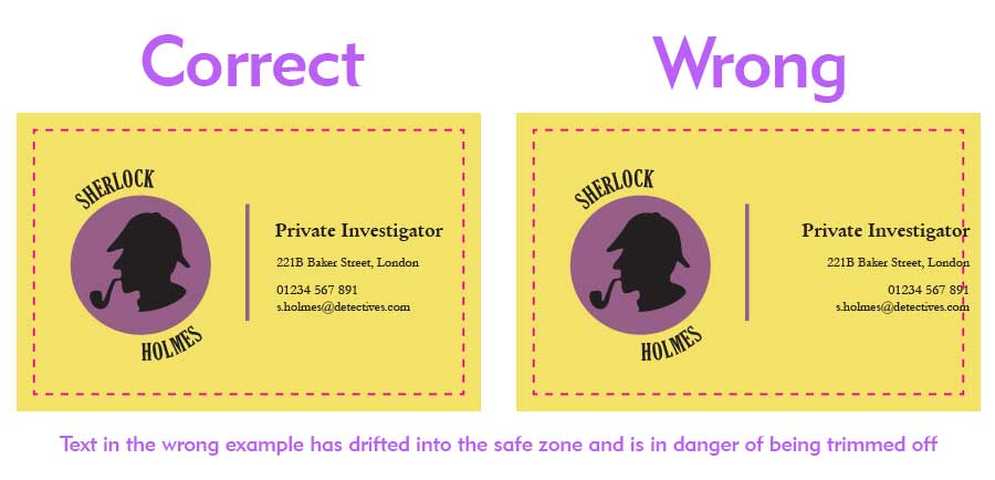
Is there any text in the safe area?
Check there is no text in the ‘safe area’ of your artwork.
Any text within 3mm of the edge of the page is in danger of being clipped when the sheet is cut to size.
The ‘safe area’ (in this example) is visualised as a pink dashed line.

What colour space am I using?
Every digital file uses a colour space. This will either be RGB or CMYK.
RGB is generally used for screens. CMYK is used for printing.
It is best to provide your artwork as a CMYK file.
What is RGB?
RGB stands for Red, Green and Blue. These are the primary colours of light. The RGB colour space is designed to be used with artwork that will be displayed on a screen (website / video / powerpoint presentation)
If your artwork is set up in RGB colours it will look very vibrant and luminous when viewed on screen (because it is light emitting) but this is impossible to reproduce in print. Your artwork will be converted to CMYK when printed and the colours may be quite different from what you expect.
What is CMYK?
CMYK stands for Cyan, Magenta, Yellow and Black (We use K because B might be confused with blue). These are the colours traditionally used in print.
You should use CMYK for artwork that is to be printed!
Please note, the colours you see on your computer monitor or mobile will never truly represent the colours that will be printed.
Even digital artwork saved in a CMYK colour space will only give an approximation of what you will see in a printed document.
If you are worried about colour reproduction, we would suggest you request a hard copy proof before production so that tweaks and adjustments can be made.
How can I make my file use CMYK?
Most design programmes will enable you to set up CMYK in one of the following ways:
- Set the colour mode when you setup your file to: CMYK (sometimes called Process Colours)
- Set the colour profile to: Forgra 39 (ISO 12647-2:2004);
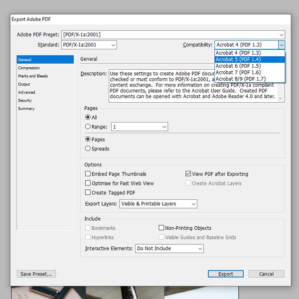
- You can export to PDF using an industry standard preset: PDF/X-1a:2001. This will automatically set your PDF in a CMYK colour space. (NOTE: If you are using transparency in your design you will need to make sure your compatibility is Acrobat 5 or higher).

Am I ready to send my artwork?
Your artwork should now look like this:
- Single pages at the correct size
- Bleed & cut marks if necessary
- No text in safe area
- CMYK
- 300 Dpi Resolution
Good news! You are now ready to email us your artwork!
Please submit your artwork to: dyerandson@gmail.com
Any questions, please call us on: 01372 373100